In 2012 ITV went through a rebrand, so that they could find a different way to portray their channel. They rebranded all 5 of their channels as they felt a rebrand would be a better way for them to advertise their programmes.
The main ITV logo is a colour picking design which changes to suit its backdrop as well as the nature of its programming.
National and regional ITV News programmes also adopt a new look and feel both on air and online. Regional news programmes have consolidated their naming styles in line with a more consistent branding across ITV.
Some people said that they like it and it is more of a friendly ident. Other people don't think that it is serious enough, especially for things such as the News.
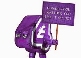
On October 31st E4 brought back their character from when they first started the channel which is named Eefer. E4 haven't updated their idents for about six years so a recreation to keep them in the market of interesting TV was crucial, their TV rivals had all re-done their idents over the past few years, so E4 was due a recreation.
People have said to think that it is a lazy rebrand and just putting a dots on the board was not creative enough. Others think that their new creations are too mainstream and they need to be more individual to stand out.


No comments:
Post a Comment